Dashboard From Raw Data to Revenue Intelligence
A Complete Sales & Orders Analytics Transformation Story
🌍 Introduction: Why Data Alone Is Not Enough
In today’s fast-paced business environment, companies generate massive amounts of data every single day. However, having data is not the same as understanding it. Many businesses sit on valuable information without realizing its true potential simply because it is not structured, visualized, or interpreted effectively.
Sales reports often exist in spreadsheets filled with numbers, rows, and columns. While these spreadsheets contain critical insights, they are not designed for quick decision-making. Business leaders, managers, and stakeholders need clarity, not complexity.
This project focuses on solving exactly that problem — transforming raw monthly sales and order data into a powerful, interactive, and insight-driven dashboard that enables smarter and faster business decisions.
💼 The Business Challenge
Before building the dashboard, the data existed in a raw and unstructured format. It included:
- Monthly sales revenue figures
- Number of orders per month
- No visualization for comparison
- No clear identification of trends or patterns
Key Problems Faced:
- ❌ No visibility into best and worst-performing months
- ❌ Difficulty in comparing sales vs order volume
- ❌ Time-consuming manual analysis
- ❌ No storytelling or insights from data
- ❌ Lack of decision support for business growth
This created a gap between data availability and data usability.
💡 The Objective
The goal was simple yet powerful:
To convert raw data into a visually appealing, interactive, and insight-driven dashboard that empowers decision-makers.
Key Objectives:
- Create a single view to compare Sales and Orders
- Highlight top and low-performing months
- Provide quick summary metrics
- Enable pattern recognition through visualization
- Add business insights for decision-making
🛠️ The Solution Approach
To solve the problem effectively, a structured approach was followed:
Step 1: Data Understanding
The dataset included 12 months of data with:
- Total Sales (Revenue)
- Count of Orders
Step 2: Data Cleaning
- Ensured no missing or duplicate values
- Standardized month names
- Verified numerical accuracy
Step 3: Data Transformation
- Aggregated monthly totals
- Prepared data for visualization
- Structured it for chart compatibility
Step 4: Visualization Strategy
Instead of using separate charts, a combined chart approach was used:
- 📊 Bar Chart → Represents Sales
- 📈 Line Chart → Represents Orders
This allowed:
✔ Easy comparison
✔ Better visual storytelling
✔ Dual-metric analysis in one view
🎨 Dashboard Design Philosophy
A dashboard is not just about charts — it’s about experience.
Design Principles Used:
1. Simplicity
The dashboard was designed to be clean and easy to understand at first glance.
2. Visual Hierarchy
Important elements like total sales, total orders, and best month were placed at the top.
3. Color Psychology
- Purple → Sales (Revenue focus)
- Green → Orders (Growth indicator)
4. Consistency
Uniform fonts, spacing, and layout were maintained throughout.
5. Responsiveness
The dashboard is designed to work across devices including desktop and mobile.
📊 Dashboard Components Explained
🔹 1. Header Section
The header clearly defines the purpose:
“Sales & Orders Performance Dashboard”
This sets the context immediately for the viewer.
🔹 2. Summary Cards (KPI Section)
At the top, three key metrics are displayed:
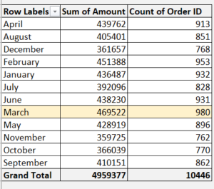
- 💰 Total Sales: ₹49,59,377
- 📦 Total Orders: 10,446
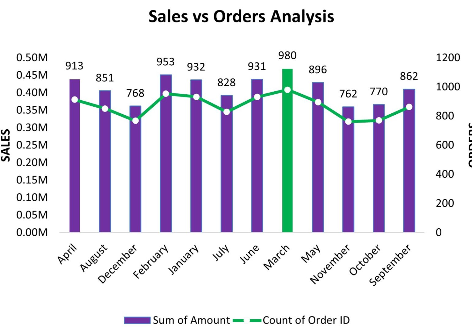
- 🏆 Best Month: March
These KPIs provide instant insights without needing deep analysis.
🔹 3. Interactive Chart
The heart of the dashboard.
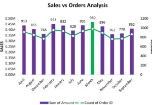
A combination chart is used:
- Bars → Monthly Sales
- Line → Monthly Orders
Why this works:
- Allows dual comparison in a single view
- Helps identify trends visually
- Makes patterns easy to understand
🔹 4. Insight Section (Most Powerful Part)
This is where data becomes valuable.
Instead of just showing numbers, the dashboard explains them:
- March recorded the highest performance
- November showed the lowest trend
- Sales and orders move together (positive correlation)
This transforms the dashboard from informational → actionable.
🔹 5. Filters & Interactivity
To enhance usability:
- Month selection filter
- Metric toggle (Sales / Orders)
- Dynamic updates
This allows users to explore data on their own.
📈 Key Findings & Insights
🏆 1. Top Performing Month: March
- Highest Sales: ₹4.69L
- Highest Orders: 980
👉 Indicates peak demand and strong business performance.
📉 2. Lowest Performing Month: November
- Sales dropped significantly
- Orders were also low
👉 Suggests a need for marketing or operational improvements.
🔗 3. Strong Correlation Between Sales & Orders
As order count increases, sales also increase.
👉 This indicates:
- Stable pricing strategy
- Consistent revenue per order
🔄 4. Consistent Performance Trend
Most months show stable performance with slight variations.
👉 Indicates a reliable business model.
🧠 Business Impact
This dashboard delivers real-world value:
✔ Faster Decision-Making
No need to analyze spreadsheets manually.
✔ Improved Strategy Planning
Businesses can focus on high-performing months.
✔ Performance Tracking
Easy comparison across months.
✔ Opportunity Identification
Quickly spot low-performing periods.
⚡ Advanced Value Addition
What makes this dashboard premium:
- Clean UI/UX design
- Storytelling with insights
- Interactive elements
- Business-focused approach
This is not just a dashboard —
👉 It is a decision intelligence tool
💻 Technical Implementation
This dashboard can be built using:
- Advanced Excel (Pivot + Charts)
- Power BI
- Tableau
- Web-based tools (Chart.js, HTML, CSS)
It is scalable and customizable based on business needs.
🚀 Use Cases
This type of dashboard can be used in:
- E-commerce businesses
- Retail analytics
- Sales performance tracking
- Monthly reporting systems
- Business presentations
📊 Before vs After Transformation
Before:
❌ Raw data in tables
❌ No insights
❌ Hard to understand
After:
✅ Interactive dashboard
✅ Clear insights
✅ Easy decision-making
👨💻 About Me
I specialize in turning complex data into meaningful insights using:
- Data Analysis
- Dashboard Design
- Excel Automation
- Business Intelligence Tools
My goal is simple:
Help businesses make smarter decisions using data.
📩 Let’s Work Together
If you’re looking for:
✔ Professional dashboards
✔ Data-driven insights
✔ Business intelligence solutions
Then you’re in the right place.
Let’s transform your data into powerful insights 🚀
Building the Future of Digital Sales with Agentic AI: A New Era of Enterprise Transformation